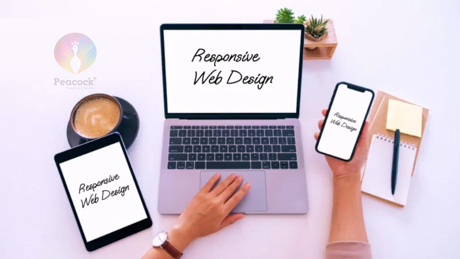
With over 50% of web traffic coming from mobile devices, having a responsive website is not just an option—it's a necessity. Responsive web design ensures your website adapts seamlessly to different screen sizes, providing an optimal experience on desktops, tablets, and smartphones.
What is Responsive Web Design (RWD)?
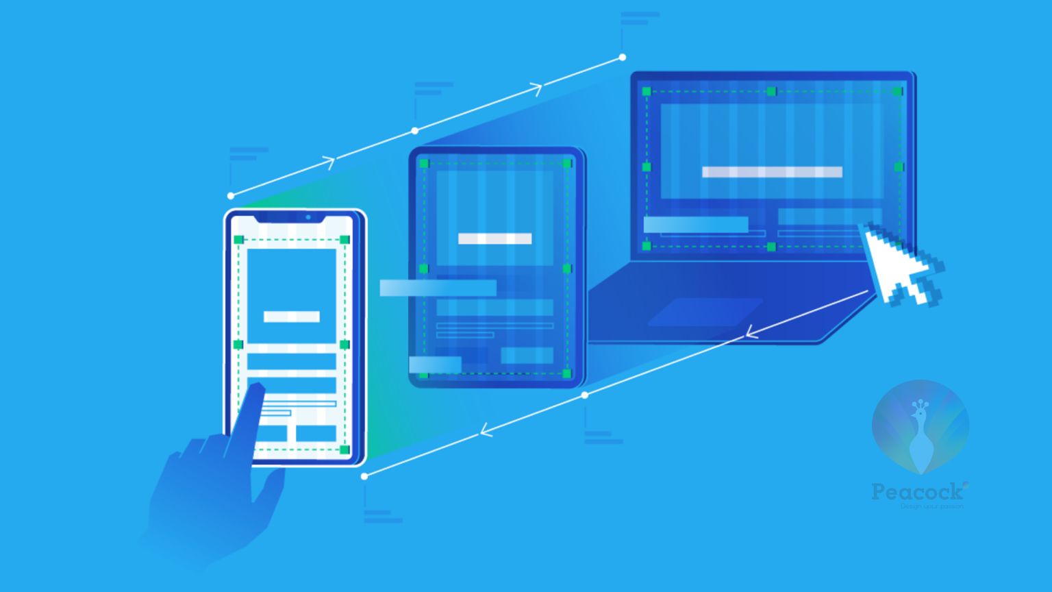
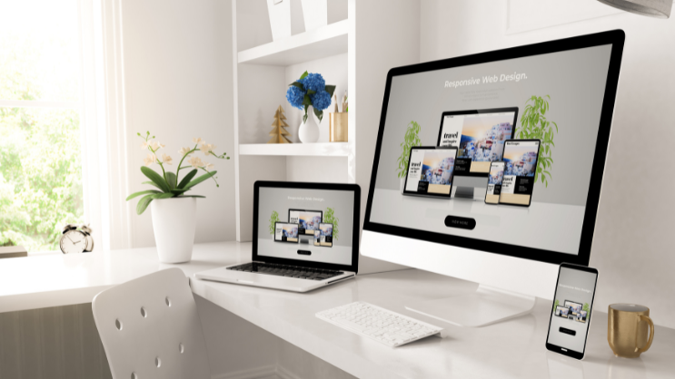
Responsive Web Design (RWD) is a design approach that ensures web content adjusts smoothly across a variety of devices and screen sizes. This approach uses fluid grids, flexible images, and media queries to create a consistent experience for all users.
Why Responsive Design is Crucial in 2025:
- 🌐 Mobile-First World: Increasing mobile internet usage demands mobile-friendly websites.
- 📈 SEO Benefits: Google’s mobile-first indexing prioritizes responsive websites in search rankings.
- 🚀 Improved User Experience: Enhances user engagement, session duration, and conversion rates.
What You’ll Learn in This Guide:
- Core principles of responsive design
- Best practices for fluid layouts and media
- How to implement responsiveness in real-world projects
- Tools and resources to enhance responsive design
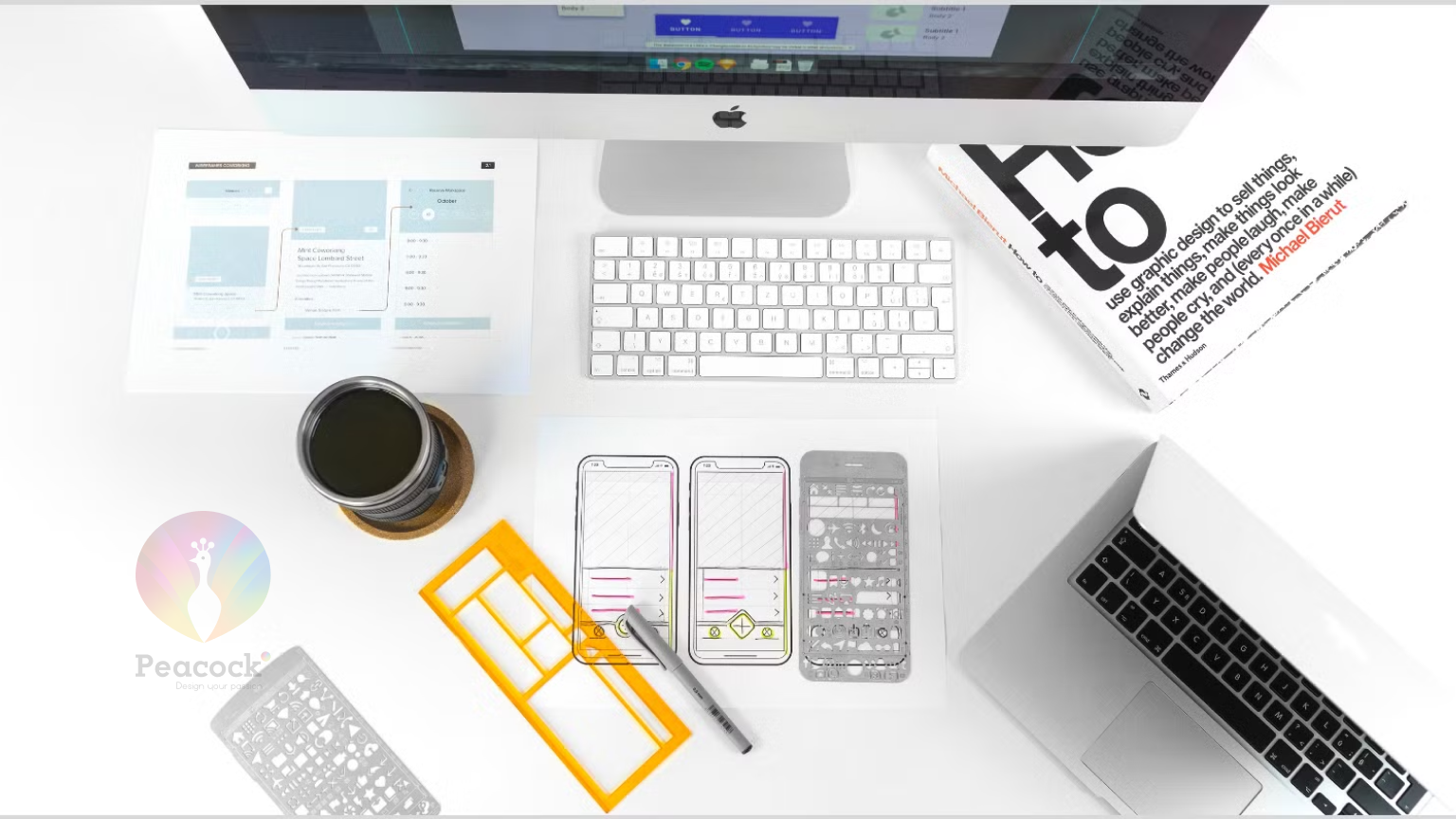
Core Principles of Responsive Web Design
1. Fluid Grids
Fluid grids use percentages rather than fixed pixels to define element widths, allowing them to scale proportionally on different devices.
Best Practice:
- Use CSS Grid and Flexbox to create dynamic, adaptable layouts that flow naturally with screen size changes.
2. Flexible Images and Media
Ensuring images and media are responsive involves setting their maximum width to 100% while maintaining their aspect ratios.
Best Practice:
- Implement srcset in images to serve appropriate sizes based on device resolution.
3. Media Queries
Media queries are CSS techniques that allow styles to adapt based on device characteristics, such as screen width, orientation, or resolution.
Best Practice:
- Establish breakpoints at common device widths (e.g., 320px, 768px, 1024px, 1440px) to handle layout adjustments efficiently.
4. Mobile-First Approach
A mobile-first approach involves designing for mobile devices first and scaling up for larger screens. This approach prioritizes content and functionality for mobile users, leading to simpler, faster-loading websites.
Best Practice:
- Write CSS styles for mobile devices first, then add media queries for desktop enhancements.
5. Touch-Friendly Design
Responsive websites must accommodate touch interactions, ensuring that buttons, forms, and interactive elements are easily accessible.
Best Practice:
- Make touch targets at least 48px by 48px and avoid small elements that are hard to tap.
Best Practices for Implementing Responsive Web Design
1. Prioritize Performance
- Compress Images: Use modern formats like WebP or SVG to reduce file sizes.
- Lazy Load Media: Load images and videos only when they enter the viewport.
- Minimize HTTP Requests: Combine CSS and JavaScript files to optimize load times.
2. Use Responsive Units
- Relative Units: Replace px with %, em, rem, and vw/vh for scalable layouts.
- Flexible Typography: Implement fluid typography using CSS clamp() or calc() functions.
3. Set Effective Media Queries
- Set breakpoints based on design needs, not specific devices.
- Example Media Queries:
- @media (max-width: 480px) { /* Mobile devices */ }
- @media (max-width: 768px) { /* Tablets */ }
- @media (max-width: 1024px) { /* Desktops */ }
- @media (max-width: 1440px) { /* Large screens */ }
4. Ensure Consistent Navigation
- Adaptive Menus: Use hamburger menus, off-canvas menus, or dropdowns for small screens.
- Sticky Navigation: Keep important links visible as users scroll.
5. Test on Multiple Devices
- Real Device Testing: Check your website’s performance on different devices and screen sizes.
- Emulators and Simulators: Use browser developer tools to preview responsiveness.
- Cross-Browser Compatibility: Ensure consistency on Chrome, Firefox, Safari, and Edge.
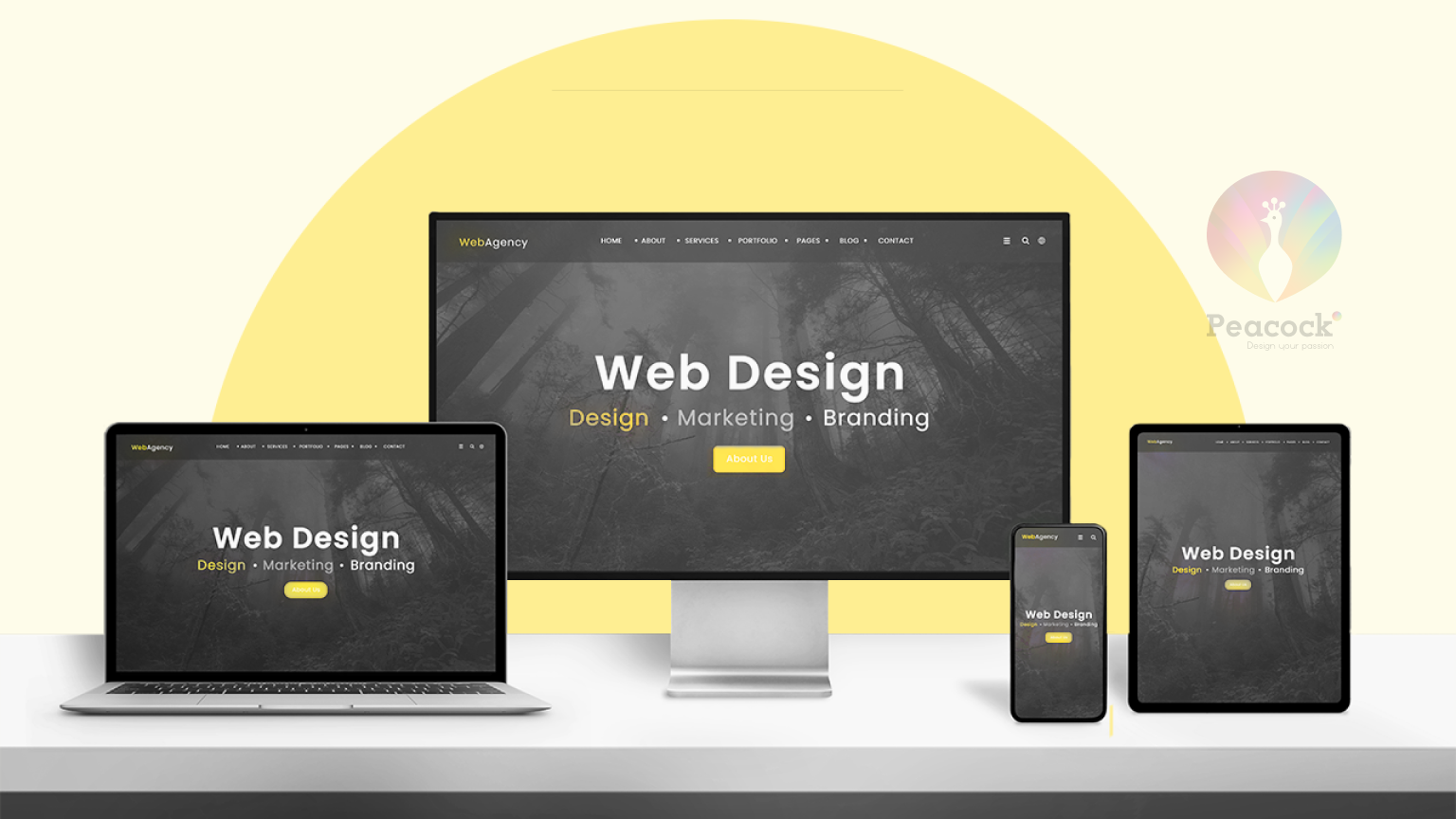
Real-World Examples of Responsive Web Design
1. Apple
- Why It Works: Seamless image scaling, adaptive typography, and a mobile-first approach.
2. Shopify
- Why It Works: Utilizes fluid grids, media queries, and touch-friendly navigation.
3. Slack
- Why It Works: Consistent branding and functionality across desktop and mobile platforms.
Also read
Tools and Resources for Responsive Web Design
Design Tools:
- Adobe XD: Design responsive layouts and prototypes.
- Figma: Create responsive designs with auto-layout features.
- Sketch: Build scalable designs and responsive components.
Development Tools:
- Bootstrap: A CSS framework with built-in responsive components.
- Tailwind CSS: Provides utility classes for responsive design.
- Media Queries Level 4: Use modern CSS techniques like container queries.
Testing Tools:
- Google Mobile-Friendly Test: Check if your website is optimized for mobile.
- BrowserStack: Test websites on real devices and browsers.
- Responsinator: Preview how responsive websites look on popular devices.
Elevate Your Website with Responsive Web Design
Key Takeaways:
- Responsive web design is essential for modern, mobile-first websites.
- Follow best practices like fluid grids, flexible media, and strategic media queries.
- Regularly test and optimize your website on multiple devices.
Is your website truly responsive? If not, it might be time for an upgrade. Contact Peacock India today for expert responsive web design services that enhance user experiences and boost conversions!


